Even though I haven’t stopped painting, it’s been a long time since my last Infinity game. A few weeks ago, the idea of organizing an escalation league began to take shape in my playgroup. Our aim is to ease entry for new players and to help veterans pick up where they left off.
While I was still thinking about which faction I wanted to play, the new Varuna sectorial made its appearance. I saw it bright and clear! What better way to resume the game than to start painting something new from scratch?
WHY VARUNA?
Aside from the hype surrounding this release, one of the things I like the most about Varuna is the Kamau. I was always been fond of both its profile and the miniatures and now I can play them as a linked team!
Apart from that, they have a completely different playstyle than what I am used to playing with Military Orders or USARF, which I essentially treated like a hammer. I want to know what it feels like to play with a scalpel, and Varuna is full of troops that make precise cuts in the enemy lines before disappearing.
PREPARING THE TROOPS
Since the league is in an escalation format (we all start with 100 points and we daily increase the available points), it’s not mandatory to have a lot of miniatures from the beginning. This is great, because it allows me to prepare and organize the combat groups into small objectives to complete little by little.
Even so, I couldn’t resist setting up the entire starter and some other troops that could be useful in future missions. This is a Croc Men Sniper and a couple of remotes. My fingers were already full of glue and metal filings!

BREATHING LIFE INTO VARUNA
One of the first things I do, even before I have the miniatures in my hands, is to figure out what color scheme best suits them.
As time is short and the miniatures are aimed to play, I needed a scheme that would be easy to apply but spectacular on the table. Since Varuna belongs to PanOceania and its iconography is blue, I started thinking about options that were complementary on the colour wheel.
Blue, white, black and LEDs in red is the classic scheme, but I also wanted a touch of color on some armor plates. Orange is complementary to blue, so it would have a lot of contrast, but (yes, there is always a “but”) those LED wouldn’t look great in red. So I moved around a bit on the color wheel and eureka! I got a Blue-Green, Orange-Yellow and Red-Violet triad, with a lot of contrast and harmony between them.

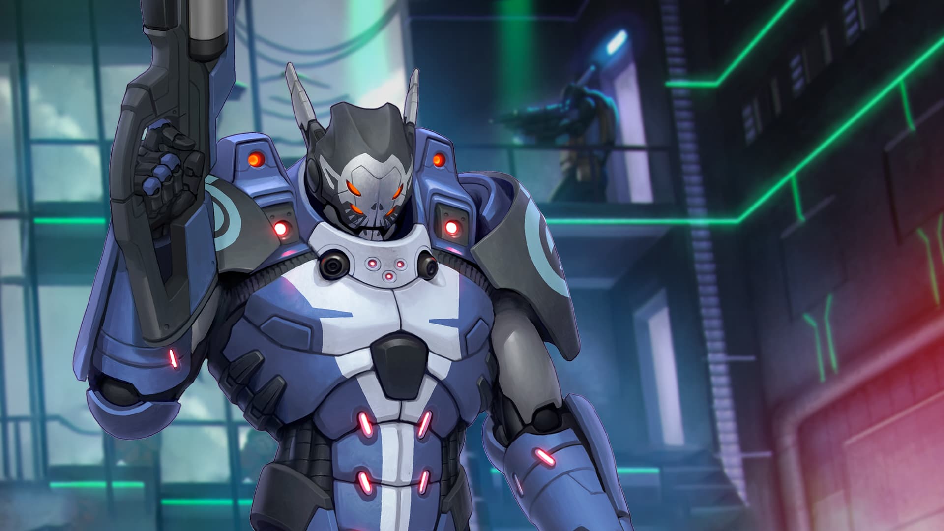
Now we just have to put the theory into practice. For that, the ORCO troop seemed the most appropriate one, because of his pose and the fact that it displays a huge portion of his armor that favors a fantastic result.
This is the outcome after a few hours with the airbrush and brushes.


Do you want to follow the growth process of the Minotauro Studios army? If so, don’t miss the next article on this blog.
You can follow Sergio Luque on his social media network: